F&M Construction Rebrand
Rebrand an already existing brand improving the typography, tagline, layout, mood, symbols and color combinations based on the company.

Fischer and Mader Construction is the Construction company I chose for a rebrand because their current brand was very outdated with the typography, imagery, length and overall layout. I started with shortening the name so that this way it is easier for consumers to remember and easily read from far away. This was achieved through a bold serif font matched with a stretched san serif font to create a simpler and clean design. I also wanted to simplify the logo while making it more clearer as to what the company does. Which is why I chose the stacking of the three lines to depict the targeted audience’s roofing types; residential, agriculture, and commercial. The stacking also references this notion of building and roofing, which is what the company does. The color red was kept the same because it is what the company currently had and is also able to represent their business well, being that red is a construction color.


Original vs Final Rebrand


Process


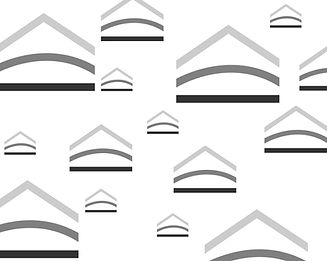
Patterns


Brand Book


Van Handel Farms
Rebrand an already existing design improving the typography, layout, mood, symbols and color combinations based on the company.


This design was important to me because it was created to surprise my dad and grandpa to show their generations of farming in the family. Which is indicated with the dates on the front of the sweatshirts. The design was based on the original retro apparel that was created nearly 30 years ago (I figured it was time for an upgrade). The cow and “Van Handel Farms” typeface stayed the same but the color, secondary typography, and the front chest design needed to be rebranded because they were outdated. It was a learning process, but I am very excited with the way that it turned out.


Milwaukee Wordmark
Create an Instagram post that communicates the spirit of the city of your choosing. Identify an appropriate image that compliments the typographic design and city atmosphere.

I chose Milwaukee and the essence of that city is water. My typographic design illustrates water through the reflection of the text “Milwaukee.” The thick, bold font on the top is to serve as the shore and the thin, oblique font is to represent the reflection. The baseline that separates the text is to keep them grounded while symbolizing the shoreline. The background photograph exemplifies the typographic design as it presents Milwaukee’s shoreline. The placement of the text on the image emphasizes the notion of water and the reflection it is entailing. With the text being the color white, it contrasts the deep blue background and creates depth in the design.
Final

Process


REVISION
Create your own brand that represents the beverage of your choice. Prototype your beverage's single and multipack designs along with a promotional display or social media presence.

REVISION is a classical wine for all types of wine drinkers. It allows an easy communication of the flavor notes and sweetness to the customers. Presenting a quick and easy decision in the store. Sit back relax and enjoy a glass or two.
Finals


Cookbook
Create two spreads for a cookbook that are original and depict a typographically pleasing layout of the recipes given. The design must include all the information provided with each recipe. Consider the layout of the pages together, grid system, typographic detail and design.


“Garden Quesadillas” and “One-pan Tropical Chicken Tacos” were my given recipes. I was very excited about this project because I absolutely love cooking. Which gave me an advantage because as a cook I had an idea as to what a helpful layout would be. I started with laying out all the content on the page and dividing up the information from primary on the front and the secondary information on the following page. My favorite part of the organization is the color bar at the top of the page that indicates the category of meal. The background images also hint at what the meal will look like and make the viewer want to make it. The relationship of the images and text on each page creates a visible flow and allows the viewer to become engaged with the design. For each spread I gave an unique color palette that also references an ingredient in the recipe. The designs are different in that matter, but still obtain similar layouts to show that they belong in the same book. The aesthetic was to show a fun, festive, yet modern layout. The font chosen emphasizes this theme while still being legible
Process


NOMILY
Design a solution to a problem in your life. Create a prototype, infographic, brand guidelines, video, website and pitch deck. Present your solution to a panel of judges then display your work at the DVC Entrepreneur Showcase.

Nomily is a resource that strengthens the bond between family, health, and food. Reinventing how we view dietary restrictions to guarantee something good for everyones’ plates.
Mission Statement:
We are committed to celebrating family, health and food. We provide a way to eat that reduces the impact of food restrictions on meal preparation allowing families to focus on creating memorable experiences for all
Vision Statement:
NOMILY brings happiness to every plate while bringing families closer at the dinner table.
Slogan:
Serving happiness on every plate
Tagline:
Eat the best, share the rest


Promotional Video
Brand Guidelines and Infographic


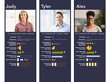
Poster and Personas


Design and Visual Communications Entrepreneur Showcase


Process-branding


Process-infographic


Process-Personas